CLIENT
Estility LTD
DATE
August, 2024
WEBSITE
www.estility.com
ROLE
Design Lead
UX Designer
Brand Strategist
Estility Website Re-design
– CASE STUDY
Here’s how I worked with a team to re-focus the actions of Estility’s web visitors from booking boring demos to downloading the app and experiencing convenience first hand.
UX Design, Team Co-ordination, Business Strategy, Web Optimization
The Opportunity
Estility had a massively high bounce rate. Over 90% of the visitors left within the first 4 seconds without taking any desired action
Bounce rate, user engagement and other key actions are at the heart of any online business. Estility was lacking greatly at all of these, and it lead to a pretty frustrated marketing team and the business was tanking!
We needed to find a way to fix as many of these as fast as possible:
- Poor UI Layout
- High Churn Rate
- Low Conversion
- Brand Inconsistency
Business attributes
THE PRINCIPLES THAT GUIDED THE DIRECTION OF THE PROJECT
Innovative
Innovation is the core of the company. Estility is a startup, working in constant uncertainty.
Convenience
Estility is in the business of bringing convenience to everyone. This had to be evident
Servanthood
Estility prides in it's servanthood mentality to serve every customer in the best way
tech
Estility is heavily dependent on technology as it's backbone. It speaks volume of the business
What we did
Strategize, Plan, Implement
We needed to address a couple of issues ranging from Brand Consistency, to Originality, User Experience and Retention, then finally, Influence User Actions
To tackle this as the team lead, I proceeded with having multiple phased meetings with the team to make sure we’re all clear on what is needed for the success of the project.
We stated KPIs and assigned different members to specific sections of the project. This helped us easily measure how close we were to our goal and identify points that were lacking very early on.
Strategize, Plan, Implement
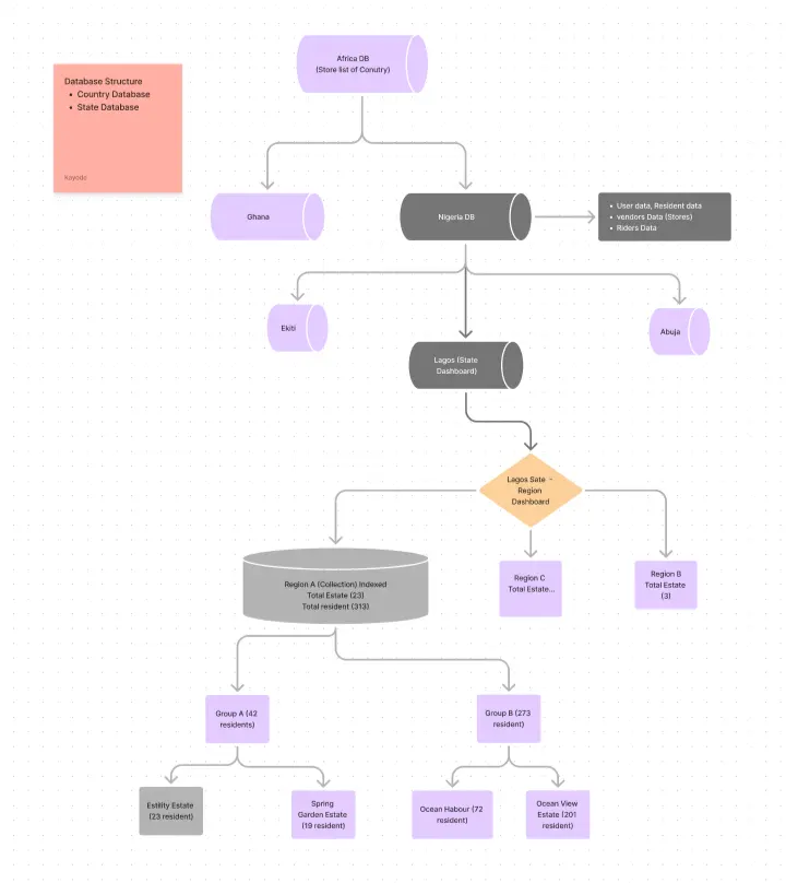
In the planning phase, it was necessary to understand how the database was structured, so we had a quick session with the developers.
This gave us clearer insights on what is easily achievable with the already existing architecture
Sessions like this usually reduces the designer-developer friction that’s very common in tech teams.
Strategize, Plan, Implement
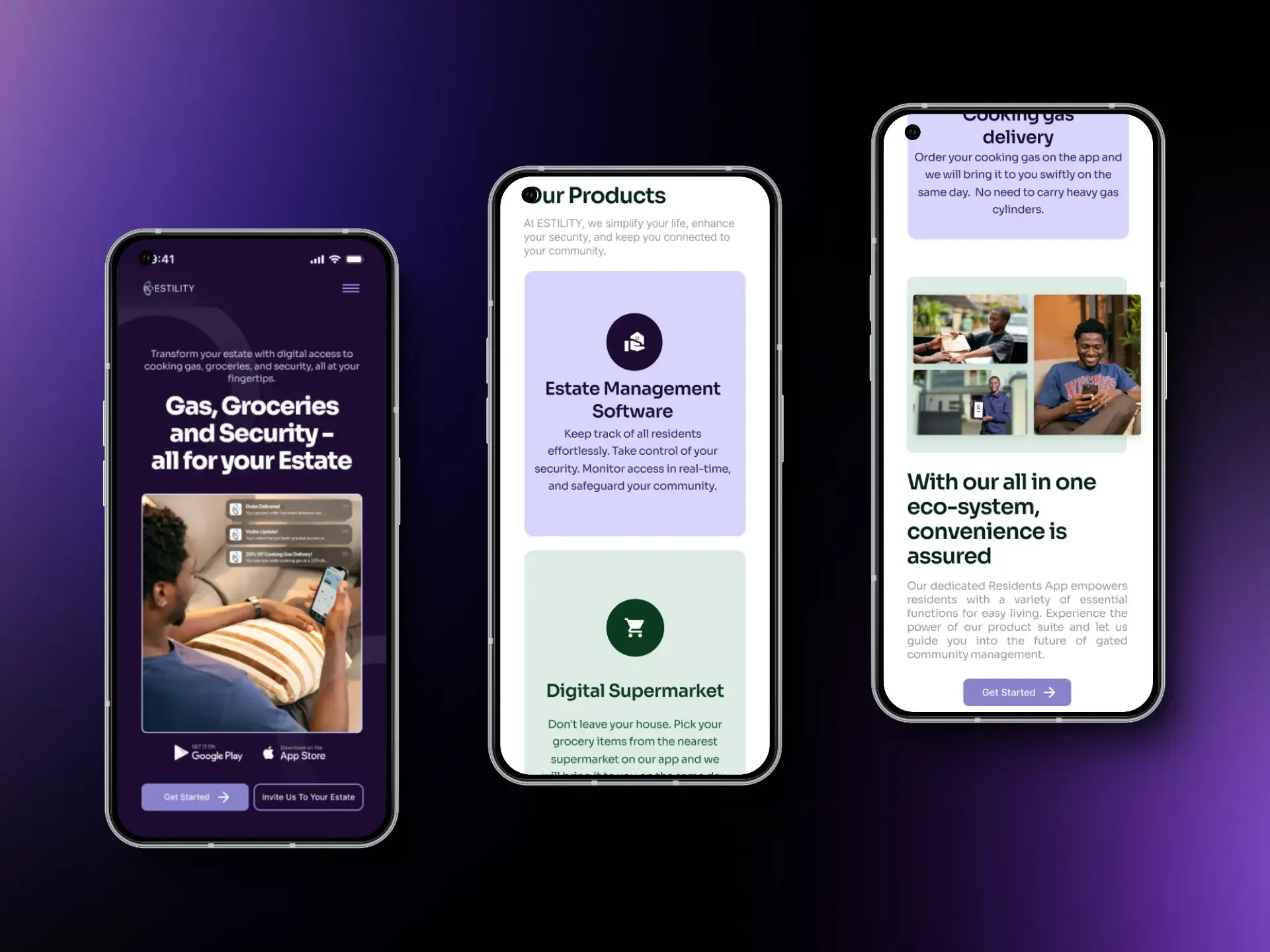
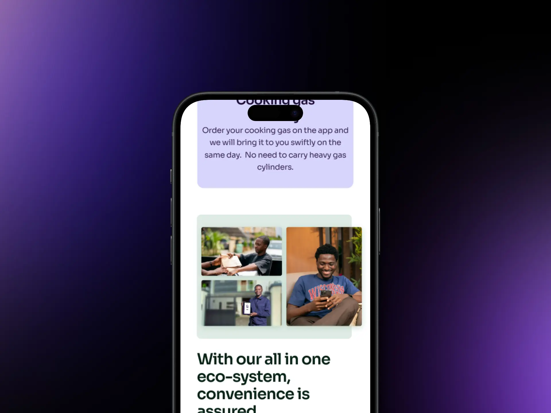
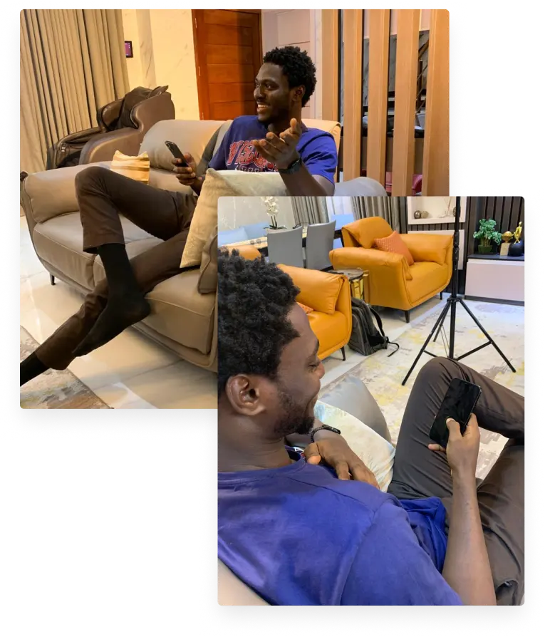
While planning, we realized the need to have custom imagery for the business, so we proposed one and got a shoot session booked.
The custom photography session helped boost the team’s morale while giving us the leeway to come up with specific top-notch imagery for the website.

Strategize, Plan, Implement
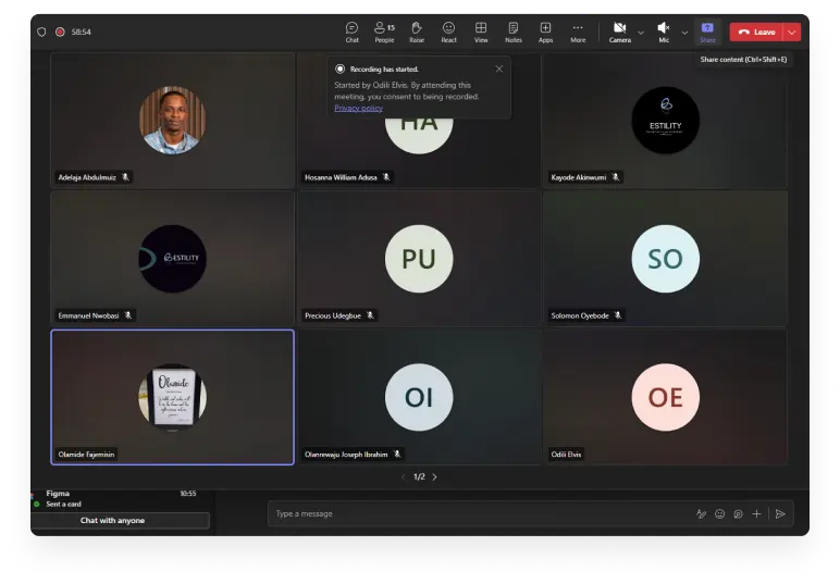
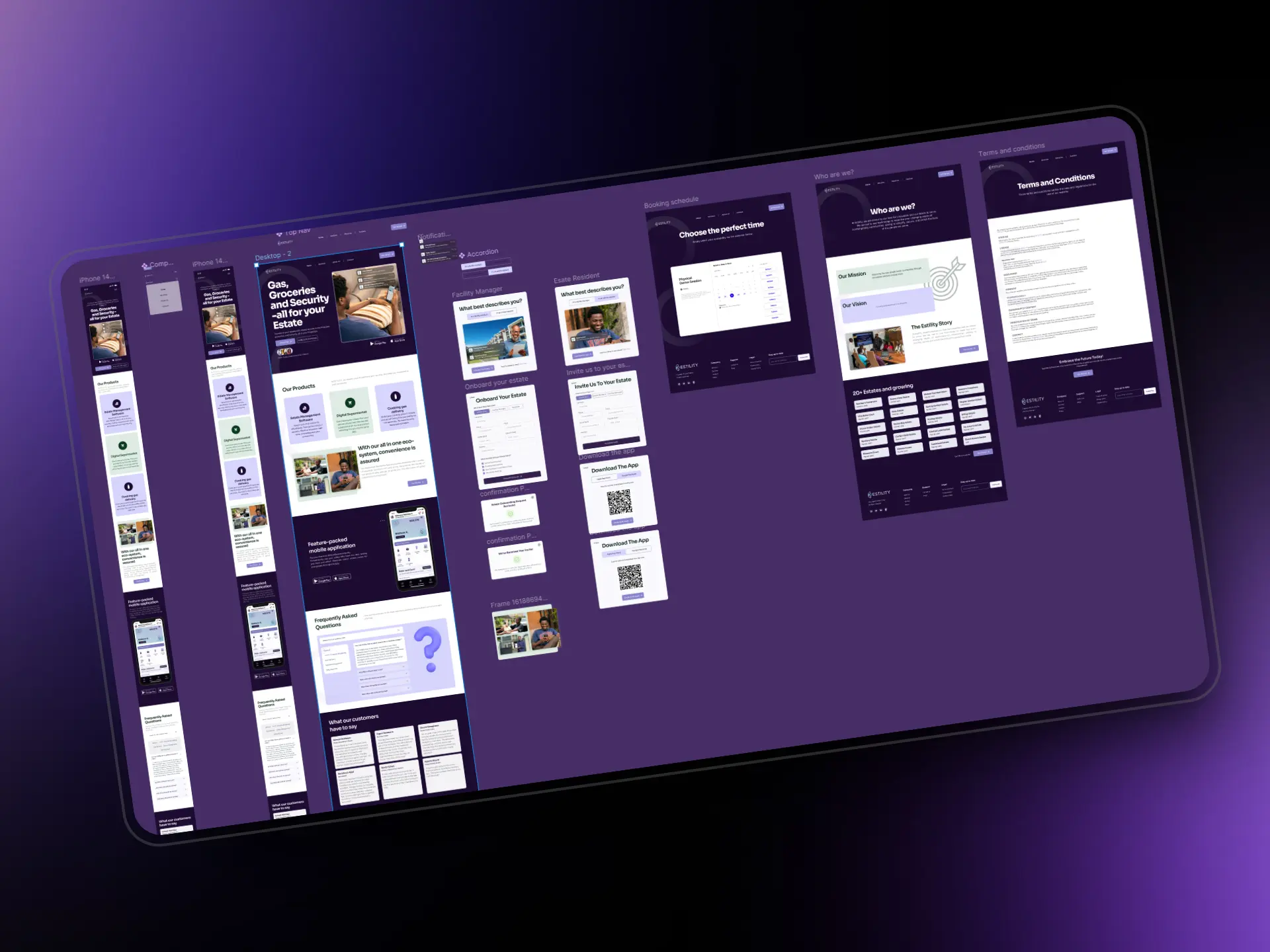
After all the planning and strategy sessions, we got to work!
We had a couple of iterations prepared and regularly requested feedback from stakeholders and other external team members. This helped us fine-tune the entire experience taking into cognizance our biases.
We were able to fail fast and fail cheap with this approach.
Strategize, Plan, Implement
We ended up with 2 different design approaches initially, and had the stakeholders decide which design direction will better fit the business' needs.
I usually find this helpful when dealing with projects as it makes the stakeholders feel like they're being carried along, and this is especially necessary for post-project satisfaction.
The Developer Saga!
Strategize, Plan, Implement
Remember the session we had with the dev team right? Well it didn’t totally remove all the friction, lol.
A couple of components were not as designed, missing sections and un-aligning margins. It made me want to go crazy 😭
Thanks to the QA team, we were able to go over all of the misalignments and address them painstakingly before it was pushed to production.
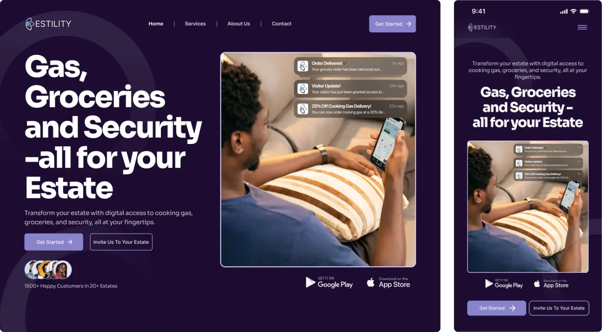
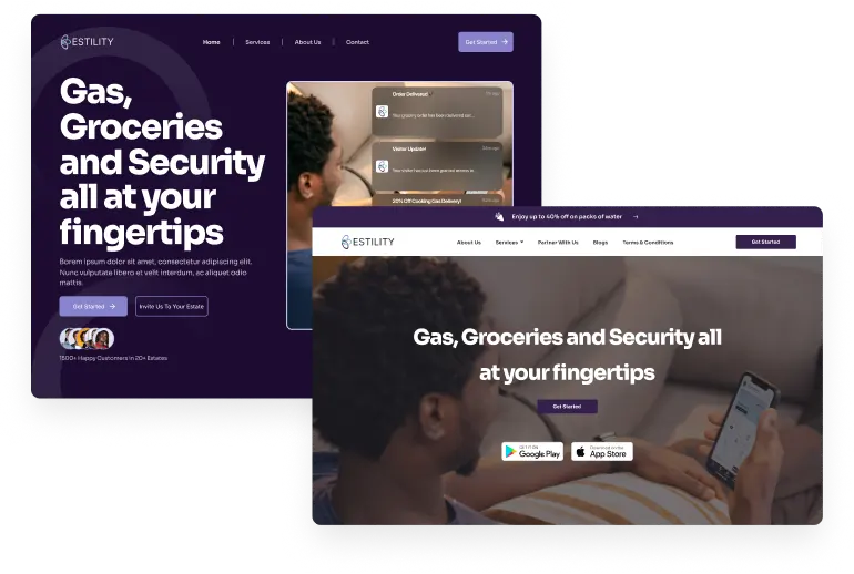
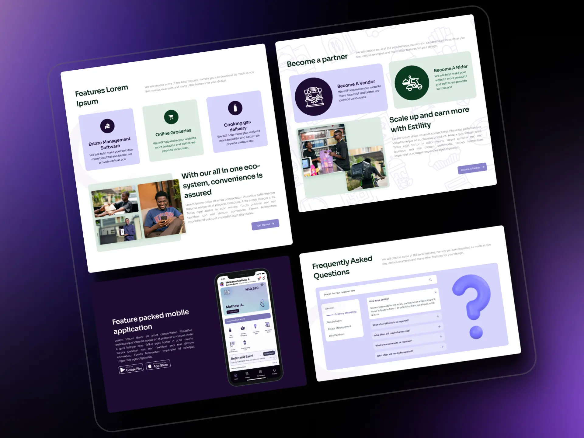
The Outcome (Branding)
Refined Design, Bespoke Experience
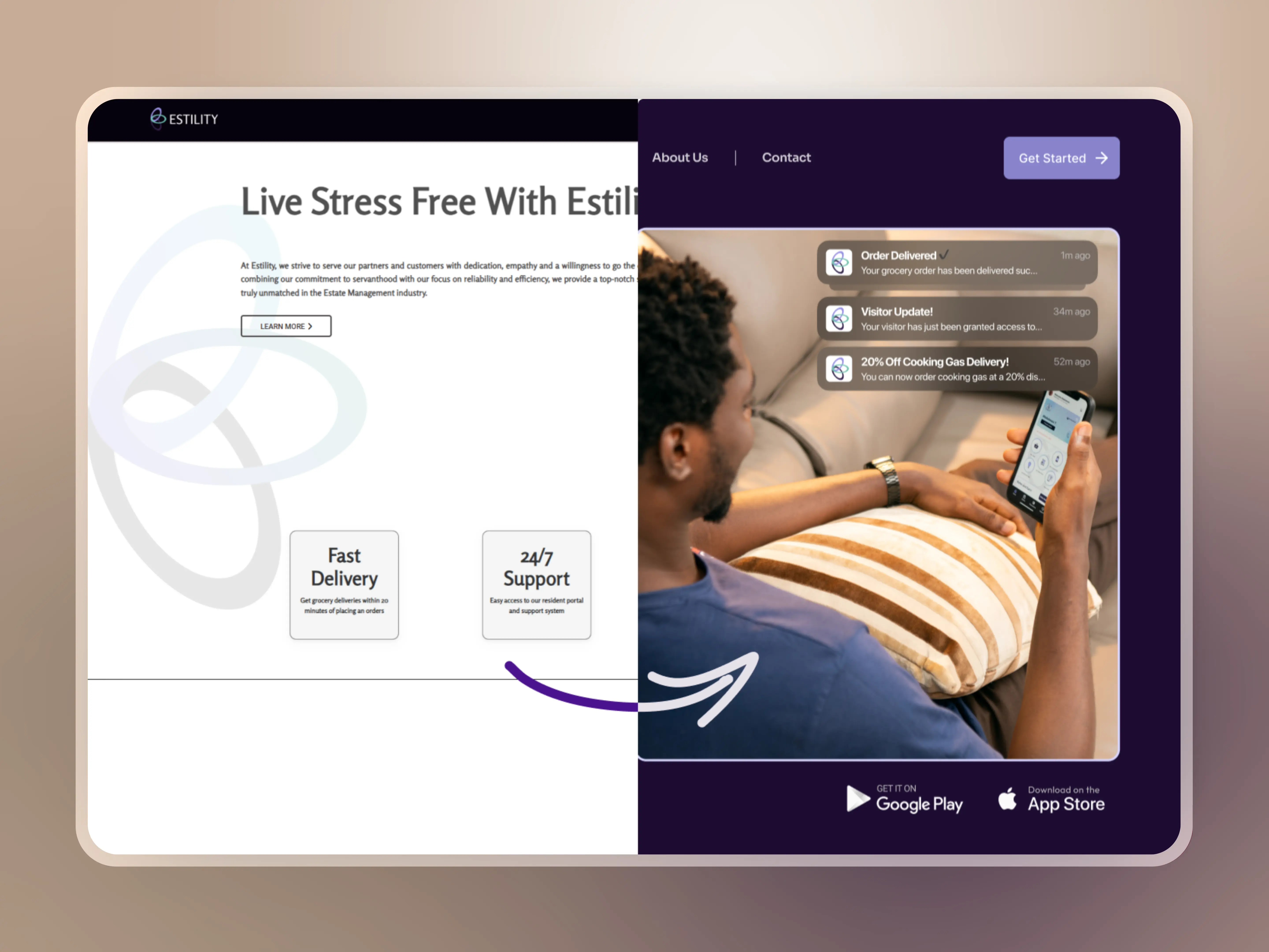
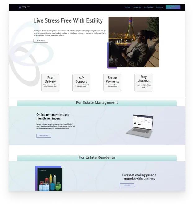
Estility's brand mantra preaches convenience and we had to take an approach that emphasizes this, while making sure everything stays visually consistent across board.
I focused more on the general first impression and perceived value as this can go a long way in how the customers interact with the business.
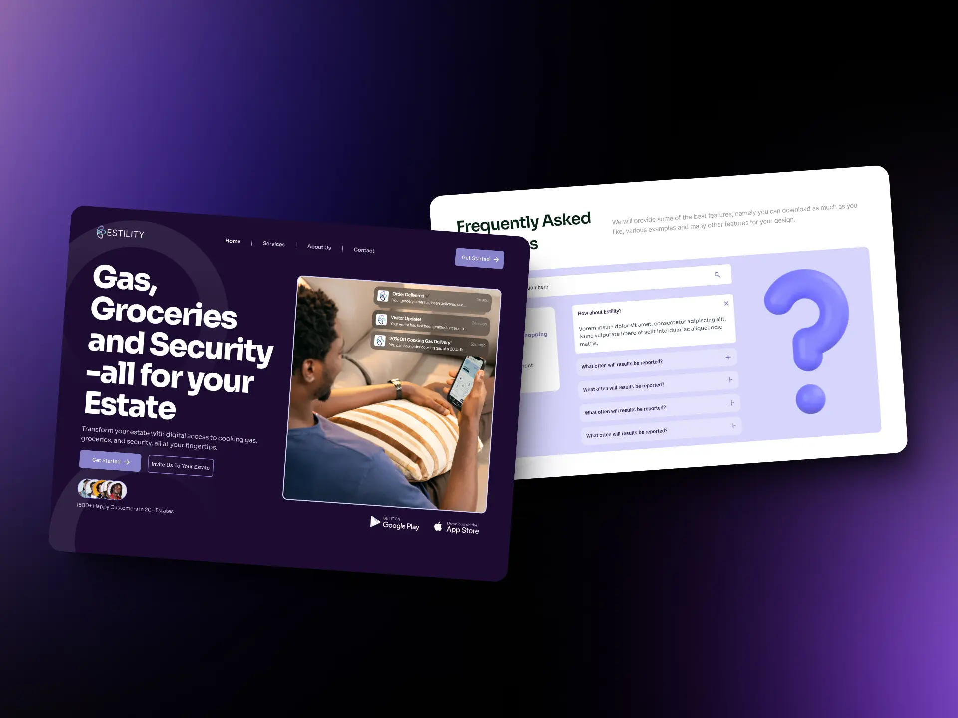
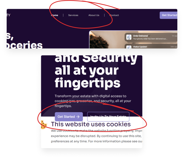
The Outcome (UX)
Better CTAs, Clearer Communication
Being A business model that's not so conventional, it was more than necessary to find the perfect set of words for every section, CTA and button.
We worked closely with the business' legal adviser to make sure we were within the legal scope while trying to make the UX copy a hit!
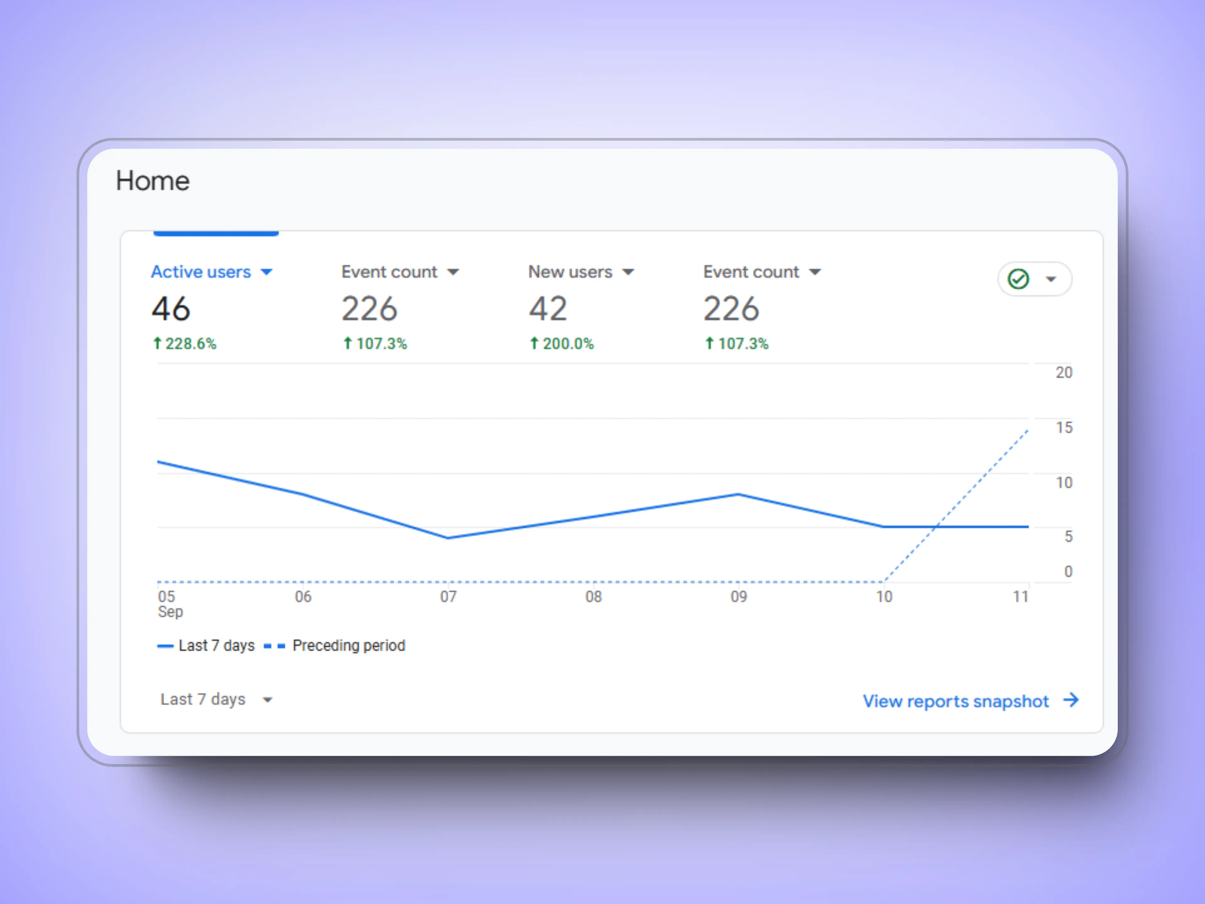
The Outcome (User Analytics)
Lower Bounce Rates, Higher event Counts
Not to blow my own trumpet, but the result speaks for itself.
This was measured a few weeks after the new version of the website went live and massive improvements were recorded.
228% more active users, 107% more events recorded, 200% more new users, are the key ones amidst many other positive reports.